Device usage in web development impacts design and functionality choices. The digital landscape is constantly shifting, and the way users access information online is at the forefront of this change. For web developers, understanding device usage is no longer a nicety – it’s a necessity. This blog post delves into the latest trends in device dominance, explores their impact on the real estate industry specifically, and provides actionable tips to craft responsive websites that cater to clients across all platforms.
The Shifting Sands of Screen Size
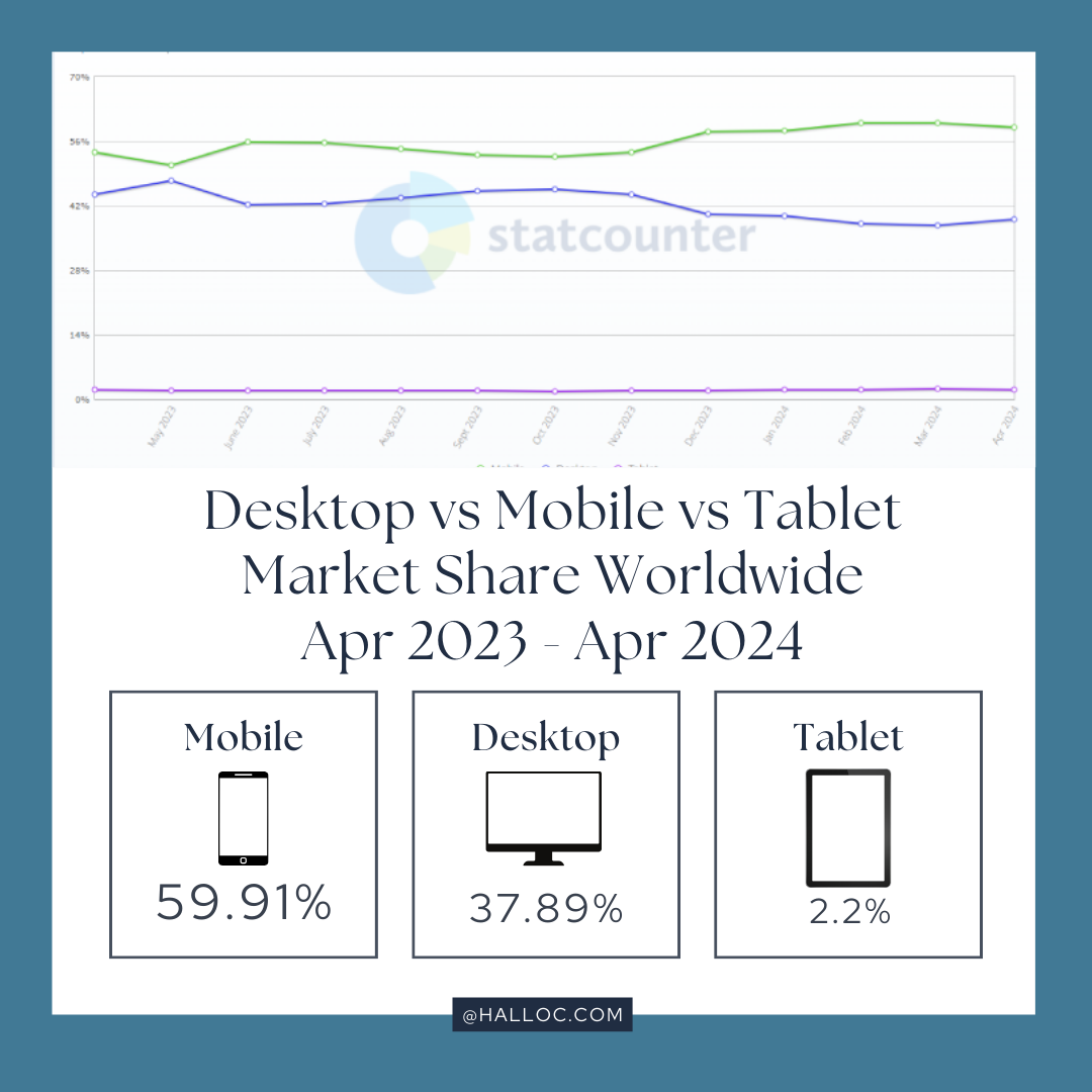
Statcounter paints a clear picture: mobile devices hold a staggering 59.91% share of the global internet market share [1]. This dominance can be attributed to the ever-present nature of smartphones and tablets in our pockets and purses. Mobile responsiveness has become the cornerstone of successful web development. Websites must seamlessly adapt to smaller screens, ensuring users can navigate listings, view property details, and connect with you effortlessly, regardless of location.
Desktops: Not Extinct, But Evolving
However, dismissing desktops entirely would be a strategic misstep. Specific demographics, such as serious investors and second-home buyers, often rely on desktops for in-depth market research and detailed property information. This is where desktops continue to shine, with their larger screens ideal for viewing virtual tours, high-resolution photos, and comprehensive property descriptions. Optimizing your website for desktop use remains crucial. Ensure clear navigation, high-quality visuals, and detailed content to cater to this segment of users.
Tablets: A Niche to Consider
Tablets, with their intermediary size, occupy a smaller niche market share of around 2.2% [1]. Nevertheless, they shouldn’t be entirely disregarded. Imagine a potential customer browsing listings on their tablet during a break at a coffee shop. Considering targeted tablet-friendly content, such as interactive neighborhood guides or property comparison charts in a responsive format, can help capture this audience segment effectively.
Desktops: Not Extinct, But Evolving
Building Responsive Websites: Beyond the Buzzword
Understanding device usage is the foundation, but effective web development requires actionable strategies. Here’s how to translate insights into practice:
By understanding device usage trends and implementing these responsive design principles, web developers can craft websites that not only look great but also function flawlessly across all devices. This translates to a significant competitive advantage, as you’ll be catering to the ever-growing mobile audience and ensuring a positive user experience for all.
- Embrace Responsive Design: Responsive design ensures your website automatically adjusts its layout for optimal viewing on any device – desktops, mobiles, and tablets. This creates a seamless user experience across all platforms.
- Prioritize User Experience (UX): Focus on intuitive navigation, clear calls to action, and fast loading times across all devices. Aim for a frustration-free experience, regardless of how users access your website.
- Optimize Visuals for Different Screens: Stunning photos and virtual tours are key for both mobile and desktop users. Ensure images are optimized for various screen sizes to avoid slow loading times that can lead to user abandonment.
- Leverage Device-Specific Features: Take advantage of features like mobile menus, touch-friendly buttons, and geolocation capabilities to enhance the user experience on specific devices.
- Test, Test, and Test Again: Rigorously test your website across various devices and screen sizes to ensure optimal performance and identify any potential issues before launch.
Ready to create responsive websites that conquer any screen size? Contact us today for a free consultation and discuss how our team of experienced developers can help you build future-proof web solutions!
et Halloc help you to take your business to the top of the search result. Every great website starts with a conversation. Schedule a free consultation with one of our friendly Halloc experts. And we’ll dive deep into your unique needs, goals, and target audience. This is your chance to ask questions, explore possibilities, and get a personalized roadmap for your online success. Follow us on Instagram for the latest updates and exclusive content.